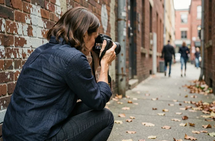
You photograph a scene that pleases you, you click the shutter, and the result on the screen looks nothing like what your eyes saw. The problem rarely comes from the camera. It stems from how you frame the scene in your viewfinder. Mastering photo shots and framing means learning to choose what goes into the image and, above all, what comes out of it.
Vertical Framing and Social Media: Why Rethink Your Photo Shots
The majority of images are now viewed on a smartphone screen, held vertically. This simple fact changes the game for framing. A beautiful wide horizontal shot on a computer screen becomes tiny on a phone, with black bars crushing the subject.
Thinking about framing in portrait mode first forces you to rethink space management. The margins above and below the subject become more important. The breathing space around a face or object shrinks laterally, naturally pushing towards tighter and more readable shots on a small screen.
You can deepen this logic by studying different photo shots and framing examples to understand how each type of shot adapts to the vertical format.
Specifically, if you are preparing a photo for Instagram or TikTok, start by framing in 4:5 or 9:16. Place your main subject in the upper third of the image. The viewer’s eyes will land there first on a vertical screen. A landscape? Try to find a vertical element (tree, pole, silhouette) to anchor the composition in this format.
Close-up or Wide Shot: Choose According to the Photo’s Intent
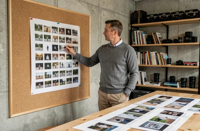
Have you ever noticed that a close-up portrait conveys a very different emotion than a full-body portrait? The choice of shot is not a matter of mechanical distance. It is a narrative decision.
The Wide Shot Places the Subject in Its Environment
A wide shot (or long shot) shows the context. It answers the question “where are we?”. Use it when the location tells a story: an empty street, a mountain, a cluttered workshop. The human subject appears small, almost absorbed by the setting.
The wide shot works when the background carries as much meaning as the subject. If the background adds nothing, tighten the frame.
The Waist and Bust Shots Focus Attention
The waist shot cuts at the waist level. The bust shot cuts at the chest level. These two framings eliminate the superfluous and direct the gaze towards the face and hands, the two most expressive areas of the body.
A common pitfall: cutting at joint levels (knees, ankles, elbows). This creates a “limb amputated” sensation that disturbs the eye. Cut between joints, never above them.
The Close-up Isolates a Detail
An eye, a hand on a texture, a specific object. The close-up forces intimacy. It works well when you want to reveal a detail that the viewer would not have noticed alone. In portraiture, a very tight framing on the face requires precise focus on the eyes. If the eyes are blurry, the image loses its anchor.
Guidelines and the Rule of Thirds: Concrete Composition Markers
Composition relies on how you organize elements in the frame to guide the gaze. Two practical markers are enough to transform most images.
The Rule of Thirds, a Reliable Starting Point
Activate the grid on your camera or phone. Two horizontal lines and two vertical lines divide the image into nine zones. Place your main subject on one of the four intersections, not in the center. The viewer’s gaze will then circulate more naturally within the image.
A subject placed on a point of strength creates a more dynamic image than a centered subject. This is not an absolute rule, but it is a reflex that improves the majority of common photos.
Guiding Lines Lead the Gaze
A road, a fence, a ray of light, a row of trees: these natural lines present in the scene lead the viewer’s eye towards the subject. Identify them before you click the shutter.
- Diagonal lines bring dynamism and depth, ideal for landscapes or urban scenes.
- Horizontal lines convey calm and stability, suitable for wide shots over water or the horizon.
- Converging lines (rails, paths, perspectives) create a vanishing point that draws the gaze towards a subject placed at the end of the perspective.

Intentional Imperfect Framing: A Photography Trend to Understand
Framing guides emphasize precision: straight horizon, well-placed subject, respected lines. A recent photographic trend takes the opposite approach to this normative stance.
Some photographers deliberately choose a slightly off-kilter framing or a not-quite-straight horizon. The subject is a bit off-center, an element is cut at the edge of the frame. The goal: to create an image that appears spontaneous, less “manufactured,” in an anti-digital perfection logic.
This trend does not mean that you can frame any way you like. The difference between intentional imperfect framing and a failed photo lies in the intent. If you tilt your horizon by two degrees accidentally, it’s a mistake. If you tilt it by eight degrees to create visual tension, it’s a deliberate aesthetic choice.
- Try slightly cutting off the top of a subject’s head in a tight portrait to enhance proximity.
- Decenter your subject beyond the third to create an imbalance that draws attention to the empty space.
- Tilt the camera sharply (dutch angle) to energize a static scene, but use this effect sparingly.
Imperfect framing works when it serves an intention, not when it masks a lack of mastery. First, learn the classic markers, then transgress them knowing why.
Framing remains the most accessible lever to improve your photos without investing in equipment. Changing the shot, pivoting vertically, moving the subject a third to the right: these micro-decisions made before clicking the shutter do more for the quality of an image than any filter applied afterward.